2-D Weather Plotting using Visualization
To plot a 2-D graph and understand the Weather conditions

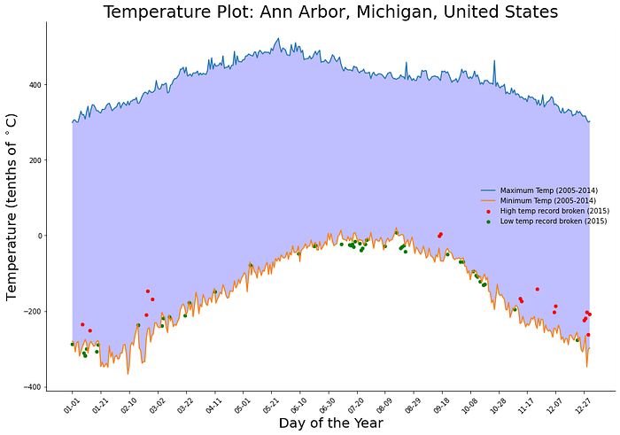
Using Visualization, we can plot a 2-D graph consist of information about the weather. This visualization helps in studying the temperature changes that occur in the environment. It also helps in predicting the changes in the environment in the future and helps the world to save humanity from difficult temperature conditions.
How did this graph become?
First of all, we needed NumPy, pandas, and matplotlib dictionary for data exploration and visualization. Using Numpy we can clean the data and clear all the none values and with pandas, we convert the CSV file into a data frame and do various functions with the data frame using various pandas functions. For visualization, we use the matplotlib and create a 2-D graph.
Data Exploration
The entire dataset consists of 430980 rows with the following columns named ID, Date, Element, and Data_Value. Rows containing null values would be cleaned using NumPy and then we can load our dataset using pandas.

Importing Libraries
Import pandas, NumPy, and matplotlib using the below cell.
import matplotlib.pyplot as plt
import matplotlib.dates as dates
import matplotlib.ticker as ticker

import pandas as pd
import numpy as np
Load the Dataset
For the dataset, you can download it from here.
Now load the dataset using pandas library and named that dataset as df.
df=pd.read_csv('172a2fdce873f964749851f7565d3b3b189fad6bce734e5a5eaf082d.csv')Now create two new columns named Year and Month-Date and add the year and month, date from the Date column.
df['Year'], df['Month-Date'] = zip(*df['Date'].apply(lambda x (x[:4], x[5:])))Extracting the maximum and minimum temperature
In this part, we extract the maximum and minimum temperature in every year and create two data frames one consists of maximum values of temperature names temp_max and another one consists of minimum values of temperature named temp_min.
temp_max = df[(df['Element'] == 'TMAX') & (df['Year'] != '2015')].groupby('Month-Date').aggregate({'Data_Value':np.max})temp_min = df[(df['Element'] == 'TMIN') & (df['Year'] != '2015')].groupby('Month-Date').aggregate({'Data_Value':np.min})

temp_max_15 = df[(df['Element'] == 'TMAX') & (df['Year'] == '2015')].groupby('Month-Date').aggregate({'Data_Value':np.max})temp_min_15 = df[(df['Element'] == 'TMIN') & (df['Year'] == '2015')].groupby('Month-Date').aggregate({'Data_Value':np.min}broken_max=np.where(temp_max_15['Data_Value']>temp_max['Data_Value'])[0]broken_min=np.where(temp_min_15['Data_Value']<temp_min['Data_Value'])[0]
Now Create a 2-D graph
using matplotlib, now we can create a 2-D graph that shows the pattern of change in temperature.
First, we plot a figure using plt.figure function, and then using the temp_max and temp_min values we plot the outlines of the graph and fill the area with blue color.
Now, on the x-axis, the values are the dates of the particular year, and on the y-axis, the values are of temperature in celsius.
Now using the scatter function, we plot the small red dots in the graph where the temperature is too high which makes the record, and green dots represent the low-temperature record.
At last, we set the labels of x and y as Temperature (Tenths of C) and Day of the year respectively.
plt.figure(figsize=([15,10]))

plt.plot(temp_max.values, label='Maximum Temp (2005-2014)')
plt.plot(temp_min.values, label='Minimum Temp (2005-2014)')

plt.gca().fill_between(range(len(temp_min)), temp_min['Data_Value'],temp_max['Data_Value'], facecolor='blue', alpha=0.25)

plt.xticks(range(0, len(temp_min), 20), temp_min.index[range(0, len(temp_min), 20)], rotation = '45')

plt.scatter(broken_max, temp_min_15.iloc[broken_max], s=20, color='red', label='High temp record broken (2015)')
plt.scatter(broken_min, temp_min_15.iloc[broken_min], s=20, color='green', label='Low temp record broken (2015)')

plt.legend(frameon = False)

plt.xlabel('Day of the Year',fontsize=20)
plt.ylabel('Temperature (tenths of $^\circ$C)',fontsize=20)
plt.title('Temperature Plot: Ann Arbor, Michigan, United States',fontsize=25)

plt.gca().spines['top'].set_visible(False)
plt.gca().spines['right'].set_visible(False)

plt.show()
The above diagram shows the graph which we make by using the matplotlib.
